Monday, July 30, 2012
Squirrely Challenge - True Love
28 Sketches - Day 10 - Teacher, Teacher
Saturday, July 28, 2012
28 Sketches - Day 9 - Drive By Shooting
28 Sketches - Day 8 - Red Hot Poker
28 Sketches - Day 7 - Emily
Wednesday, July 25, 2012
28 Sketches - Day 6
Tuesday, July 24, 2012
28 Sketches - Days 4 and 5
Sunday, July 22, 2012
28 Days of Sketches
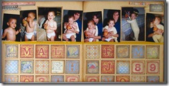
As soon as I saw the sketch for Day One, I thought of an old K &Co. paper pad in my stash which included a page of old-fashioned alphabet blocks. Perfect! I cut them into individual images, inked each one with Distress Ink and followed the sketch just about identically. The base cardstock is from Club Scrap (Henna kit).
This layout includes photos of Mallory at the age of twelve months. A ritual of distracting her with a money bag music box while getting her into jammies for the night. So cute.

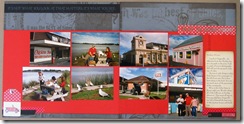
For the sketch from Day Two, I am back at work on my 1989 album of photos from our trip to New Zealand, I chose photos from our visit to Dargaville. The cardstock is from Club Scrap’s Perfect Ten kit with some embellishments from the We R Memory Keepers Travel Light pad. All edges inked with Distress Ink. Journaling is computer-generated directly from my handwritten trip diary.

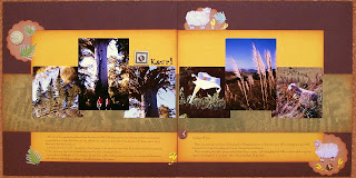
On Day Three,I was challenged by circles. I actually like circles a lot but I’m usually too lazy to dig out the circle cutter or Silhouette or other tool. While I was looking through kits for an appropriate cardstock for these photos, in the same Perfect Ten kit mentioned above there was a design WITH circles. How about that? So I cut out the circle images, laid the photos upon them and BAM, the layout is done. These are photos from a visit to Tongariro National Park and Mt. Ngauruhoe on the North Island of New Zealand. Again, the journal strips are from my actual 1989 diary.

I actually have the layout for Day Four nearly completed except for words and a few embellishments so that will have to wait for another night. Of course, there will be a new sketch tomorrow morning. Aaaaack! Can I keep up? No. But I will do my best to stay on top of things. Thanks for looking.
Tuesday, July 17, 2012
Whakarewarewa

This layout was created for the Monthly Sketch Relay at Club Scrap. I used the required sketch from Come Sail Away on a base of brown print and solid from a Michael Strong/Club Scrap collaboration called Whirligig. I also used the coordinating Michael Strong stamps. Love his stuff. The photo mats, etc. are from the Mirror, Mirror kit.
This layout is about our visit with the Durkins in 1989 to the thermal pools in Rotorua, New Zealand as part of our three week journey. That was such a great trip and I am finally getting around to making a scrapbook about it. I have overcome my perfectionistic fear that each page absolutely had to be the best scrapbook layout ever. More important to get ‘er done so we can enjoy our memories. Thank goodness I kept a detailed daily journal on the trip so all the details are carefully preserved. As I make each layout, I type out the entry for the appropriate day. For once in my life, I was organized. Thanks for looking.
Sunday, July 15, 2012
I Believe in You
Saturday, July 14, 2012
You Can Do Anything
Thursday, July 12, 2012
3 Looks, 1 Stamp – Paint Dabber

This is the third card made for the 3 Looks, 1 Stamp challenge at May Flaum’s Camp Scrap. Again, all materials are from Club Scrap. I used cardstock from the Raku kit. And the stamp is from Papillon. The bling is from my stash. All edges inked with Seedless Preserves Distress Ink.
For this Look, I pounced an Adirondack Pearl Paint Dabber onto my craft sheet which already had a coating of Mowed Lawn Distress Ink and carefully stamped the butterfly stamp into that mess. I then applied the painted stamp onto dark cardstock. The result is a shimmery look. I was quite happy with the results. Thanks for looking.
Wednesday, July 11, 2012
3 Looks, 1 Stamp – Distress Ink
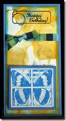
This is the second in my series of cards made for May Flaum’s Camp Scrap challenge to use one stamp in three different ways. For this one, I stamped the butterfly into diluted Salty Ocean Distress Ink on my craft sheet. Once it was dried on the cardstock, I then sprayed it with my homemade Perfect Pearls spray to allow the color to run a bit and add some sparkle.
All supplies are Club Scrap materials except the inks. The card was created with cardstock from the Solstice kit. The panel was glossy white cardstock colored with Adirondack Alcohol Inks on a craft sheet. The stamp is from Papillon. The fiber is from the Refresh kit.
Tuesday, July 10, 2012
3 Looks, 1 Stamp - Bic Mark-its
This is the first of the cards I created for a Challenge at May Flaum's Camp Scrap using 3 Looks, 1 Stamp. The stamp and cardstock are from Club Scrap. I used the stamp from the Papillon kit, colored with Bic Mark-its and then sprayed with alcohol. This card was also posted for a Club Scrap challenge hosted by Hetty to use the Pixel Embellishment technique as posted recently by Splitcoast Stampers.
The cardstock is from the Raku and Blossom kits. Paper strips were adhered together and then run through Cuttlebug to emboss them together. All edges inked with Seedless Preserves Distress Ink. Black pop dots were dusted with Heirloom Gold Perfect Pearls. Thanks for looking.
Monday, July 9, 2012
3 Looks, 1 Stamp – Camp Scrap Challenge
As part of the fun at Camp Scrap, May Flaum challenged us to use one stamp, three different ways. I chose a butterfly stamp from Club Scrap’s Papillon kit to use with Distress Ink, Paint Dabber and Bic Mark-its (my poor girl’s version of Copics). Details for each card follow under separate posts. I enjoyed this challenge and look forward to trying it again with many stamps. Thanks for looking.
Friday, July 6, 2012
Thursday, July 5, 2012
Tag Fence
This one is called Tag Fence and is fairly simple. If you would like to check it out, visit Technique Junkies. For the card panel, I am still focusing on Using My Stash by breaking into an ANCIENT pad I bought years ago from ProvoCraft called Pathways and designed by Michelle Anderson. The bicycle stamp is an oldie from Stampin' Up. The grape leaves are from a recent Fiskars set called Aged to Perfection. All inks used are from Tim Holtz Seasonal Summer set. Luscious. Thanks for looking.


